The first thing I notice about the prospectus is the
hexagons on the cover. Personally I don’t feel that they add anything to the
design of the cover, and that the opacity of the colours doesn’t really aid you
in any way. The background image is a fairly busy one as it is, so I don’t
really think the hexagons are necessary, nor is the extra colour, however, it
might be interesting to see what the image would look like if the separate
pictures in the image did have a tint of colour, because clearly whoever
designed this wanted to use colour.
Following on from my previous point, the hexagons continue
onto the back cover around the spine. While the pattern has some continuity to
it, the hexagons on the back have a mixture of block fill colours and gradient
fills, which I don’t think works very well visually. I also think that the
amount of whitespace on the back is too big, and could be used for useful text
such as contact information, or even the names of the people who produced the
prospectus.
Something I found rather irritating was the contents page.
Not only was it printed on glossy paper for no apparent reason, the page size
was noticeably smaller along the right hand side than the rest of the
prospectus. I could understand this to some extent if it was in the middle of
the prospectus on a very important page, as it would make the page slightly
easier to find when flicking through the book, but the fact that this is done
on the contents page makes it completely irrelevant. I have no particular
problem with the page itself, so if the size and stock of the page was changed,
I think it’d be fine.
Every page with a large amount of text on it is set out in
two columns, I like this continuity. What I don’t find necessary is the line
that is drawn down the middle of these columns. It is on every page, and the
colour varies from page to page. It isn’t clear why this is, my best guess
would be that it was a poor attempt at some sort of colour coding. Personally I
feel that the line just makes the pages look busier than they need to be, and
removing them would be a big improvement.
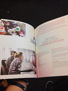
A recurring theme throughout the prospectus is the use of
images. They’re often randomly placed and don’t seem to fit in any sort of
grid. Another thing I noticed was how generic most of the images were. On one
page there’s a picture of some tubes of paint above an image of a girl on an
iMac on the page across from a page talking about higher education in general.
Examples like this are fairly numerous, and so throughout the book it’s fair to
say that the use of image is fairly poor and could be improved by using more
appropriate images organised in some sort of arrangement rather than being
seemingly randomly placed.


No comments:
Post a Comment