
Thursday, 31 October 2013
Typefaces and Fonts - Design Principles
Following on from this session and in preparation for Tuesdays session, I developed the letter X into Bold, Light and Italic in both upper and lower case to show how they would work as a typeface at this preliminary stage.

COP Lecture 2 - Type Production and Distribution
Todays lecture was quite a philosophical look at where, when and why type originated. There were a lot of quotes like "The written word endures, the spoken word disappears" and "Type is what language looks like". The general concencus is that written language started at around 3200B.C, so and so typography is a 5000+ year old art form.
We then were shown a brief chronology of the development of typography on computers, starting with the Gutenberg press, which set off the development in the 1450's. This also included the importance of the Bauhaus which had an influence in the modernist argument of form > function, and the introduction of the first Apple Computer to the public in 1990, which really started a boom in typography which has since seen the concept of type as image introduced.
We then were shown a brief chronology of the development of typography on computers, starting with the Gutenberg press, which set off the development in the 1450's. This also included the importance of the Bauhaus which had an influence in the modernist argument of form > function, and the introduction of the first Apple Computer to the public in 1990, which really started a boom in typography which has since seen the concept of type as image introduced.
Wednesday, 30 October 2013
COP - Study Task 4
This poster is an officially licensed poster for the
latest batman film, the dark knight rises, designed by Olly Moss, which he
uploaded to his blog on Sunday the 15th of July, 2012.
Batman himself is denoted by the traditional black cape,
the hood partially covering his head, and the bat shaped hole over the eyes.
Without the text on the poster, these denotations make it fairly obvious that
he is batman to anyone who has heard of him, despite how his depiction has
changed through the years, as these are key signifiers of his appearance. Another
key denotation is the use of black. Many other traditional superheroes are
denoted by bright colours, whereas batman has always worn black.
The connotations of batman are generally things like
darkness, shadows, stealth, coldness, speed, power and strength. This is
reflected in the colour scheme, the black and white blurred background gives
connotations of a lack of emotion, which also has connotations of coldness, relating
to the cold nature of batman himself. The next is slightly shadowed by the cape
not only adds another connotation to the poster, but also makes the cape look
as if it’s set forward a bit, which is coherent with the 3 dimensional shading
of the hood. The imagery in general is very effective, as a simple iconic sign
on a poster for such a well-known franchise is often the most impacting way to
get across a message.
The main code in the poster is that within our culture
and most other cultures around the world, black is symbolic of the night, and
anything shining in the darkness is a signifier of good. This in itself
positions batman to be a “goody” in this poster, without us physically having
to see an image of him beating up a villain. Another, more subtle, code that’s
used is the stereotypical use of tall, narrow text as body copy in context of a
movie poster, which is something that is very much an indexical sign of a movie
poster, especially when used in conjunction with a much larger font that’s used
for the title text.
These two codes alone come together to make a text that
is clear in its message without losing any of the edginess that movie posters
require. This is why to me, this movie poster is effective in both its
aesthetics and its suitability.

Typefaces and Fonts - Design Principles
Todays afternoon session was about learning the differences between a Font and a Typeface, two things which until now I wasn't able to distinguish between. I now know that a Typeface contains many fonts, whereas a font is the lettering in one particular style. For example, Arial Bold at 12pt is one font, but Arial Bold at 24pt is another font. The Arial typeface on the other hand includes Arial, Arial Narrow, Arial Bold etc etc, all in all pt sizes.
We had previously been asked to choose a font that best describes the 6 production methods we'd looked at last week, and print out the letters A, B, C, X, Y and Z both upper case and lower case in each font. The fonts I chose were:
Stone: Times New Roman
Sable: Lucinda Blackletter
Bone: Zipfino
Wood: Gill Sans Ultra Bold
Metal: Geneva
Silicon: Cooper Black
We were today asked to develop the capital letters of one of the 6 fonts in a consistent style in order to create our own font. I chose to develop Geneva because it was the plainest font and so had the greatest room for development. We were then told that over the coming weeks we would be developing this font into a typeface.
For next week we have to choose a letter, and reproduce it in our style of development in upper and lower case, in light, regular, bold and italic.
We had previously been asked to choose a font that best describes the 6 production methods we'd looked at last week, and print out the letters A, B, C, X, Y and Z both upper case and lower case in each font. The fonts I chose were:
Stone: Times New Roman
Sable: Lucinda Blackletter
Bone: Zipfino
Wood: Gill Sans Ultra Bold
Metal: Geneva
Silicon: Cooper Black
We were today asked to develop the capital letters of one of the 6 fonts in a consistent style in order to create our own font. I chose to develop Geneva because it was the plainest font and so had the greatest room for development. We were then told that over the coming weeks we would be developing this font into a typeface.
 |
| My Font |
For next week we have to choose a letter, and reproduce it in our style of development in upper and lower case, in light, regular, bold and italic.
Tuesday, 29 October 2013
COP - Semiotics Seminar
Todays seminar was more about semiotics, more specifically about Signs, Myth, Codes and Text.
Sign - Something that communicates a message
Signifier - Something that gives meaning
Signified - Denotation - A literal understanding of the message
- Connotation - A cultural understanding of the message
By recycling and re-using signifiers we understand what things mean and stand for automatically through their connotations. When something has lots of connotations the sign can turn into a signifier, this is called a Myth.
Signs
Icon - Resembles what the sign is referring too from the perspective of the drawer
Index - A sign that infers a relationship to something else
Symbol - A sign is obviously and literally standing for something else.
Codes are organisational systems, grids and rules that are culturally applicable and give us an understanding of signifiers.
Texts are groups of codes and signifiers that make sense within a cultural context which together communicate a broader message than any single signifier could.
 |
| Seminar Notes |

Monday, 28 October 2013
Message Delivery - Interim Crit
Todays crit confirmed to me that I was on the right track with my research, and that I needed to now narrow down my research to something I'm particularly interested in. The things I've researched are:
- The Guardian, The Dail Mail, The Yorkshire Herald and Advertiser
- Compared the way the story was reported by all 3 of the papers
- Forced labour around the world
- The process behind Qatar earning the world cup in 2022
In the research of the last point, I found out about 4 allegations of bribery by the Qatari Football Association during the voting presentation. This triggered my memory, as I was already aware of one of the allegations as I was very interested in the whole election process at the time due my strong interest in football. Despite such strong allegations, they were never convincingly cleared due to the opacity of FIFA, and the general incompetence and ignorance of the chairman, Sepp Blatter. After reading some of the quotes from FIFA and Blatter on the subject of the alleged slave labour in Qatar and on the cup itself, it has reminded me of just how controversial and corrupt FIFA actually is, and it is this element I will be researching further.
Saturday, 26 October 2013
Alphabet Soup - Typeface - Interim Crit
Today was our iterim crit for Studio Brief 3. I presented the sheets I produced about Sophie, the fonts I chose to represent her, and my initial development of merging the two fonts together. I wasn't expecting very useful feedback because of how little development work I'd actually done, although actually what most people commented on was than neither of the fonts I'd used were particularly thin, which is a characteristic I wanted in the typeface I will produce, so this is something I will concentrate on in my next stage of development. It was also suggested that I make the serifs more dainty to give a more feminine feel.
Because of this feedback I have decided that I will stop using Cantoria as a font now I will be creating my own serifs, and because of this Stone Sans will be the sole concentration of my development from now on.
Because of this feedback I have decided that I will stop using Cantoria as a font now I will be creating my own serifs, and because of this Stone Sans will be the sole concentration of my development from now on.
 |
| The Feedback On My Work, Despite The Large Amount Of Writing, It's Almost Exclusively About Line Weight And Serifs |
Friday, 25 October 2013
Studio Session - Alphabet Soup - Typeface
Today I spent a lot of time editing the 2 fonts I researched to combing them as an initial piece of development. I chose to use the lower case letters because they're what're mainly used in body copy. I traced the serifs from Cantoria in Illustrator and edited them onto Stone Sans. As an initial piece of development I feel this is quite useful as now i have an already customised font that strongly links to Sophie's personality, and I can now spend time refining the individual letters further, and use the information I'll gain in tomorrows crit.
Wednesday, 23 October 2013
Alphabet Soup - Typeface
Today I researched two fonts which I chose to represent Sophie. The two fonts were Cantoria and Stone Sans because of the reasons specified in the last post on this brief.
Cantoria
This font links to Sophie in that the the typographer used to be a cartographer for a long period of time, and Sophie enjoys travelling to new places and doing new things.
Stone Sans
I found out that Stones font foundry designed some fonts for San Francisco’s public library, it’s given me a difficult decision to make about which font to base the typeface off, as Sophies answer to the question, “what’s your favourite places in the world?”, she answered “San Francisco or Rome”, and given that Sophie has done quite a bit of travelling, it says a lot about her feelings towards San Fransisco.
In the end I have chosen to use Stone Sans as the font to base Sophie's font on because not only does it have all the requirements I wanted in the character of the individual letter forms, but it also has a direct link to one of the questions in which I found out some of the most important information about Sophie, whereas Cantoria doesn't, despite it probably being a more individual font than Stone Sans. That said, some of my experimentation could involve using parts of Cantoria in the development of Stone Sans.
 |
| The Research I Did On The Two Fonts And Their Designers |
Typography Session - The Origins Of Type
This afternoon we had a session looking at the history of
type, what the traditional way of producing the fonts are, why they were done,
and how to recognise what method of production a font descended from. We also
did an exercise on classifying fonts into different categories such as their
production, anatomy, identity and character.
Tuesday, 22 October 2013
Studio Brief 4 - Message Delivery Research

 |
| The Story I Chose Was About Slave Labour Being Used To Construct The Stadiums To Be Used In The World Cup In 2022 |
Monday, 21 October 2013
Q&A with Sophie, Alphabet Soup - Typeface
When are you happiest? When I'm with my cat.
What is your greatest fear? Falling from a great height.
Where's your favourite place in the world? San Francisco or Rome.
What's your earliest memory? Falling off the back of my chair and hitting my head on a radiator.
What makes you unhappy? Being hungover.
Who would play you in the film of your life? Scarlett Johanssen.
What's your favourite smell? Vanilla.
What's your favourite word? Subtle.
Guilty Pleasure? High School Musical.
How do you relax? Listen to my favourite bands (Alt-J, Washed Out, Frank Ocean).
If you could edit your past what would you change? Nothing as it could end up changing my entire life.
What's your dream job? Being paid loads of money to draw life drawings.
What it made me think.
Something I focused on more than anything else was that Sophie is happiest when she’s with her cat. Teenage life tends to be quite active, with teenagers tending to do a lot of things that they want to do, so the fact that Sophie answered this question with being with her cat surprised me. I was also caught by the fact she couldn't choose a single favourite place and instead gave two answers, which imply s she likes travelling. A lot of Sophie’s other answers suggest she’s generally a calm, content and happy person. I also found out that she likes cycling, reading, drawing, generally being arty, and her favourite colour is blue. From this I drew some conclusions that Sophie was a fairly cosy and homely person. So I asked her some more directed questions that would hopefully confirm this.
Would you rather sit on the sofa or lay in bed when watching TV? Sofa.
Would you rather have a hot drink or fruit juice with your breakfast? Fruit Juice.
What is your favourite time of year and why? May/June because it’s nice weather without Summer becoming too boring and long at this stage.
What it made me think.
I was hoping for answers opposite to the ones I was given to confirm my thoughts, but the fact that I was given the opposite answers suggested that Sophie gave me the opposite answers suggested to me that she was the opposite to what I initially thought. I now had this image in my head of her being in the outdoors a lot being an easy going person, spending a lot of time being happy with friends, rather than being the quiet one in the group like I initially thought. I asked some more questions.
Did you play outside a lot as a child? Yes
When you were younger at the beach would you rather build a sand castle or swim in the sea? Swim in the sea.
What time do you go to bed on average? Around midnight.
Describe your perfect holiday. A city break somewhere I haven’t been before that’s got lots of sights to see but isn’t hectic.
Do you prefer clubs, bars, or pubs? Bars.
What’re your favourite flavoured crisps? Cheese and onion.
What’re your favourite biscuits? Custard creams.
What this made me think
The fact that Sophie played outside a lot as a child and would rather have gone swimming than build a sandcastle suggests to me that she has a sense of adventure, and this is backed up by her inabiltiy to decide what her favourite place is. Having an average time for going to bed of around midnight suggests Sophie’s quite an active/busy person without being daft enough to stay up until the early hours in the morning most nights. The holiday question confirmed both of these points. The question about bars clubs and pubs showed me that Sophie is quite laid back as she prefers the atmosphere in a bar than the generally louder and busier nature than a club. The food questions showed to me that Sophie is happy with the simple things in life.
Sophie in general seems to be a fairly outdoors adventurous person who likes being busy but not stressed, has a positive attitude and enjoys the simpler things in life. I want to choose a font to base my alphabet off that reflects this, so I will choose a font that is thin and very legible as this reflects the laid back nature of Sophie. To reflect Sophies adventurous side I want the typeface to be italic as the leaning letters give the impression of moving forward. However, the fact that I had to re-think my ideas about Sophie suggests that she’s quite a complex character, so I want to pick a font that isn’t generic and has some sort of uniqueness about the shape to it’s letters. If I could find a font that has flicks at the end of the strokes that point upwards that would be great as it, in my mind, suggests positivity.
 |
| The Initial Questions We Were Given To Ask Our Partners |
 |
| Answers To Some Of The Further Questions I Asked Sophie |
Message Delivery
This morning after being briefed on Message Delivery we had a discussion about the news, and how it is delivered, be it via TV, Internet or Newspaper. We listed the different Newspapers into categorise of Tabloid, Broadsheet and Regional, as well as discussing the differences between the 3 types. We also had a brief discussion about the effectiveness of comedy TV shows as a way of learning about what's going on in the world. We talked about how different papers and channels have different affiliations with political party's, and how that affected what sort of news they would report, and the manner in which they would do so.


Friday, 18 October 2013
Alphabet Soup Final Crit and Explanation of Decisions
The main feedback given to me about my work was that I did well to avoid the obvious connotations of vernation and nature and to focus on bringing the connotations of the font (futura) and its historical and social context together. Futura was produced in post-WW1 Germany, when people were beginning to get back on their feet and business was picking up again. Futura was meant to reflect that positive atmosphere by using a clean and angular typeface, it looks "perfect", which is un-natural.
People were surprised how I'd managed to link the maths of the Fibonacci Sequence to something so natural as vernation and something so technical as futura at the same time, as well as being somewhat relieved that I'd stayed away from illustrative designs, which would be somewhat obvious and so less fun to analyse.
The first crit of the project to me confirmed to me that developing my letterforms using the Fibonacci Sequence was the way to go, so I took this advice as well as taking a couple of other ideas from my initial sheet of ten. The choice of letters was down to the initial sheet, the feedback was that the idea's exhibited on the letters G and T were the strongest, which I agreed with, but I wanted to continue working with the ideas in H, K and X. Out of the 5 letters, I decided that I'd use G, H and T as my examples as they're more commonly used than K and X. In most of my letters there was an element of re-scaling, as was the strongest theme from the initial crit, weather it be the letters dimensions or the different parts of the letters. In the H's and the Capital G's I combined this with the initial ideas from the H, K and X to create some variation, and in doing so, potentially creating further room for development.
Based on the feedback from the crit and my own personal preferences, I will probably not take any one design forward into the second brief. I will do some slight further experimentation but I know I want to cross over the 8:5 height:width idea and the 1:1.6 anatomical ratio because I think the more subtle changes will make for a more succesfful font, but the experimentation will mainly be with the rounding off of corners, as this will help distinguish my font from futura slightly.
Wednesday, 16 October 2013
COP Lecture 1 - Semiotics and the Language of Design
Had a lecture today about the language of design and how we as designers need to appreciate that we are communicating to many different people rather than just the people we associate ourselves with. We were spoke to about Semantics and how to apply them, as well as how to understand them. We were taught to appreciate that a photo of an apple isn't the apple itself, the colours will have been enhanced and the lighting will be perfect in order to give us an idea of what an apple looks like, though in reality, an apple and a picture of an apple more often than not are different. We did an exercise about symbolism and how applying colour to do different symbols can change their meaning completely, as can adding just a little bit of context. Today I learned that it doesn't matter weather what the people you're communicating is true or false, because in order to reach that market, you're going to have to communicate it anyway. The key points from the lecture were:
Visual communication is based on peoples understandings of the meanings of different symbols, signs and objects, and how adding context such as colour can change peoples understandings of them.
Visual literacy is being able to both interpret the meaning of images produced by others, as well as being able to create images that effectively communicate a meaning to other people. It also includes being able to take cultural context into consideration.
Visual Syntax is the organisation of the parts of an image. Changing the visual syntax of a picture of an object can change it's meaning, whilst the object in the picture will not change. Theses parts/elements include scale, colour, font, spacing etc.
The Visual Semantics of an image is how the image relates culturally to the process of communication. The semantics can be changed by using things like cultural references, political ideas, recognised symbols, religious beliefs etc etc.
Semiotics is the study of signs, symbolism, analogy, metaphor and communication.
A Visual Synecdoche is when part of something is used to represent the whole of something or the opposite way round, for example, the statue of liberty represents new york, but new york doesn't represent the statue of liberty. This is done when part of in image is universally recognised as only being associated with one option, for example, the statue of liberty can only be in New York.
A Visual Metonym is a symbolic image that has a close relationship with something else, which can be used as a referencing tool to communicate the idea of another thing. For example, the yellow taxi is a visual metonym of New York.
Visual Metaphors are used to transfer the meaning of one image to a different image that isn't necessarily closely related, this is done by drawing comparisons between the two images or objects.
A symbol is an image that shows an object.
A sign identifies an image as an object.
A signifier gives information about the object via the use of image.

Tuesday, 15 October 2013
Studio Brief 3 - Alphabet Soup - Typeface
Today we were given the next brief in alphabet soup. We were paired up and asked to find out about our partners personality, choose a font that represents them, and then edit that font to make a personalised font for your partner. In addition to creating the 24 letters, we have to create 6 other characters of our choice.


Saturday, 12 October 2013
Studio Brief 2 - Alphabet Soup - Illustrator
For the second brief we have to develop one of our letterforms developed in the first brief and digitise it. From the digitised letter we then have to create a full alphabet, all on Illustrator.


Friday, 11 October 2013
Alphabet Soup. Crit
During the mid-project crit this morning I picked up a few ideas from other peoples work that I wish I had considered before starting my project. I say I wish because I feel that now, half way through the project, it is too late to reconsider a potential starting point.
The first of those things is chronology. Using some sort of timed order to develop the letters like an opening bud across the alphabet could've been workable. For example, the a would be really scrunched up and enclosed like a bud, and the z would be very open and extravagant like a flower.
Secondly, someone was given the word surface, and he looked into not only how surface meant something to put your TV on, but how it could be seen as the surface of the water, and how on the surface people can appear different to how they are. By doing this he'd placed his word in some sort of context and looked into it, rather than just looking at the word itself, which is what I did, and consequently his results were much more imaginative and varied than they probably would've been otherwise.
One girl was given the word interrupt, which is a very human thing. Typography and human behaviour are seemingly very difficult to link together, so she looked at action words that are associated with interruption and based her letter forms off the action words. Consequently she had a much broader range of manipulations than I had.
The main feedback I was given is that my idea to re-shape and re-size a letter to the golden ratio was quite a strong idea, and it was unanimous that I should work further on this idea. I was complimented on my research on the Fibonacci Sequence and the Golden Ratio and it was suggested that I use these two ideas to produce serifs for the futura font. It was also suggested that I look at the Fibonacci Sequence in art, but personally I can't see how this is going to help me given that art has no limitations whereas typography is a completely different field of design.
All in all todays crit was very reassuring that I did have a usable and strong idea because I was fairly worried up to the point of the crit that my current ideas were a bit unrefined. It has definitely pointed me in the direction I should continue in.
Wednesday, 9 October 2013
COP - Study Task 3
Both images play on the arrogance of national pride, despite
the fact that the sense of national pride is completely different. The American
sense of pride is more of a collective thing, Americans as a community are
proud of how far they’ve come in their relatively short existence as a country
in this image, whereas the English sense of pride is a more individual
arrogance, the message is implying that if you weren’t in the war you’re less
of a man, less of an Englishman, than those who went to war. On top of this,
the man sat down is clearly a middle class person, which backs up the idea that
only the poor go to war. At the time this image was released more soldiers were
required naturally the middle class man was the target for the propaganda as
all the working class men who were going to go would have gone at the beginning
of the enlistment process (generally).
The stereotype of a middle class man is someone who has enough money to care for his family through a secure job, so by sending out a message that his children would want to know about his effort during the war so they could be proud of their father makes his secure job seem insignificant. Americans on the other hand are seemingly under the impression that anyone can do anything in their country, and people in their society at the time had the dream to be the man sat in the room with his family, dressed in clothes that express their pride for their country, surrounded by decoration that expresses their pride for their country, having a slave to make them feel superior to people who’ve descended from other countries, and being able to choose what countries they want to associate themselves with. That said, what lower class Englishman wouldn’t aspire to be middle class with this “perfect family” where his daughter will read while sat on his knee and his son will play with toy soldiers after the country his father fought in have just been victorious in the “greatest” war the world has ever seen.
The fonts used in each are typical of the time in each country. In the American image bold, block text is used which is associated with Texas, one of the post iconic states in the US, where the wide open space and massive amounts of land make the American Dream achievable. The English poster however uses a typically understated script font, giving the poster a personal feel to it while still allowing room for alterations in the style to highlight certain words, as shown with “YOU”.
The illustrations are rather different in that the English poster is dull and dreary to reflect the serious nature of the war, whereas the colours in the American advert are bright and vibrant, which reflects the attitude of the American people towards their country. What is odd is that the meaning of the American image isn’t immediately clear, and that the illustrator has clearly gotten caught up in his love for his country, which is something I would rarely expect from an Englishman due to his sense of individual pride rather that his nationality.
 |
| The English Image - Savile Lumley (1915) |
 |
| The American Image - Schumacher & Ettlinger (1876) |
COP - Study Task 2
The first thing I notice about the prospectus is the
hexagons on the cover. Personally I don’t feel that they add anything to the
design of the cover, and that the opacity of the colours doesn’t really aid you
in any way. The background image is a fairly busy one as it is, so I don’t
really think the hexagons are necessary, nor is the extra colour, however, it
might be interesting to see what the image would look like if the separate
pictures in the image did have a tint of colour, because clearly whoever
designed this wanted to use colour.

Following on from my previous point, the hexagons continue
onto the back cover around the spine. While the pattern has some continuity to
it, the hexagons on the back have a mixture of block fill colours and gradient
fills, which I don’t think works very well visually. I also think that the
amount of whitespace on the back is too big, and could be used for useful text
such as contact information, or even the names of the people who produced the
prospectus.

Something I found rather irritating was the contents page.
Not only was it printed on glossy paper for no apparent reason, the page size
was noticeably smaller along the right hand side than the rest of the
prospectus. I could understand this to some extent if it was in the middle of
the prospectus on a very important page, as it would make the page slightly
easier to find when flicking through the book, but the fact that this is done
on the contents page makes it completely irrelevant. I have no particular
problem with the page itself, so if the size and stock of the page was changed,
I think it’d be fine.

Every page with a large amount of text on it is set out in
two columns, I like this continuity. What I don’t find necessary is the line
that is drawn down the middle of these columns. It is on every page, and the
colour varies from page to page. It isn’t clear why this is, my best guess
would be that it was a poor attempt at some sort of colour coding. Personally I
feel that the line just makes the pages look busier than they need to be, and
removing them would be a big improvement.

A recurring theme throughout the prospectus is the use of
images. They’re often randomly placed and don’t seem to fit in any sort of
grid. Another thing I noticed was how generic most of the images were. On one
page there’s a picture of some tubes of paint above an image of a girl on an
iMac on the page across from a page talking about higher education in general.
Examples like this are fairly numerous, and so throughout the book it’s fair to
say that the use of image is fairly poor and could be improved by using more
appropriate images organised in some sort of arrangement rather than being
seemingly randomly placed.

Typography Session
In the afternoon we learned about the different parts of typography and the specialist terminology that goes along with it. We did this via a group activity where we modified letters in a similar way to which our first individual brief requires. I found this session very useful as I knew very little about typography before this point and was struggling to comprehend what sort of modifications the brief wanted us to make to our fonts, but this afternoons session cleared that up for me.
 |
| Some Work From The Exercise We Did |
 |
| The Main Thing I Took From The Session Was Terminology |
COP Seminar
This morning we had our first CoP semina, in which a few us, including myself, spoke about the 5 bits of design we'd posted on our blogs. We then had a discussion about the prospectus for LCA that was sent out the year before last and the various reasons Richard didn't like it. We then had a group discussion about the prospectus for 2014/2015 about if it was any "better" than the 2012/2013 one. Generally the reactions were mixed. After break we were shown two propaganda images, one from America in 1876 and one from England during the first world war, then discussed the similarities between them and talked about the possible reasons for the use of the particular content on either one.


Monday, 7 October 2013
Studio Brief 1 - Alphabet Soup
Today we were given our first assessed brief, alphabet soup, which requires us to create 10 different letter forms presented in a 10cm x 10cm format. The brief is shown below.

To give us a starting point, we each picked a piece of paper with a word on it out of a jar, and the word we picked had to influence the way we edited the existing letter forms of a font, which was chosen in the same method. The font I have to manipulate is Futura, and I have to do so under the interpretation of the word "vernation", a word I'd never heard before. Fortunately each word came with a dictionary entry, according to which vernation means "the arrangement of bud scales or young leaves in a leaf bud before it opens".
I then spent the remaining hour and a half or so doing some preliminary research on the font Futura, and mind-mapping connotations of vernation while trying to link the two together in some way. The only way in which I managed to do so was that vernation is a seemingly very natural thing, whereas Futura is a very blocky, bold and perfect font, and I could try and manipulate the font to look more natural by using the natural connotations of vernation as my influence.

To give us a starting point, we each picked a piece of paper with a word on it out of a jar, and the word we picked had to influence the way we edited the existing letter forms of a font, which was chosen in the same method. The font I have to manipulate is Futura, and I have to do so under the interpretation of the word "vernation", a word I'd never heard before. Fortunately each word came with a dictionary entry, according to which vernation means "the arrangement of bud scales or young leaves in a leaf bud before it opens".
 |
Futura |
I then spent the remaining hour and a half or so doing some preliminary research on the font Futura, and mind-mapping connotations of vernation while trying to link the two together in some way. The only way in which I managed to do so was that vernation is a seemingly very natural thing, whereas Futura is a very blocky, bold and perfect font, and I could try and manipulate the font to look more natural by using the natural connotations of vernation as my influence.
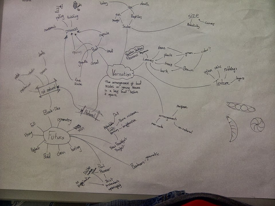 |
| My Initial Spider Diagram About Vernation and Futura |
Sunday, 6 October 2013
COP - Study Task 1
 |
Abstract Painting Number 439 - Gerhard Richter Quite a few years ago my family and I visited the Tate Modern Gallery in London, where this painting is displayed. At the time I wasn't into art and design at all, but this painting influenced me enough to start drawing and painting. I soon discovered however that I was much better doing computer-based illustrations and designs than I was at had-drawn work. Ultimately this painting is probably the reason I'm here now studying Graphic Design at LCA. I've never really been able to explain why I love this painting so much, which I find odd, given how much influence it's had on my life. |
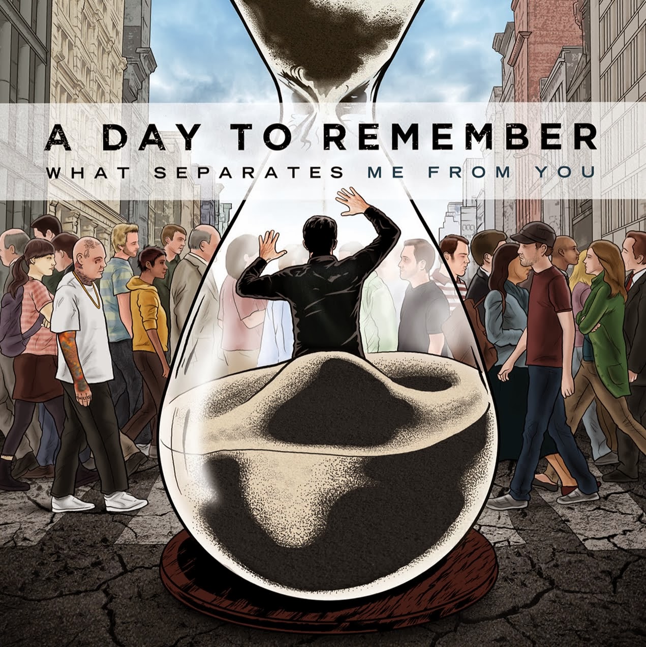 |
What Separates Me From You Album Cover - A Day To Remember I love the artwork on this album, the illustrations of the people are so detailed on a relatively small scale that from a distance they almost look like photographs. The way the image links in with the name of the title is really cool, the sense of isolation it makes me feel is really strong. I also feel that the simple typography works really well against such a busy background image. |
 |
Coffee Lovers - Marcelo Shultz I came across this typography when doing some research for one of my AS Graphic Design projects two years ago on a website called Typography Served (http://www.typographyserved.com/). I love the 3 Dimensional effect, the colours, the curves, the lighting. This sort of typography is the sort of thing I aspire to have to skills and creativity to be able to do myself after finishing the course. |
 |
Work and Influence of Cesar Manrique on the Canary Islands Lanzarote, one of the Canary Islands was home to an Architect, Artist, Designer, and all round Creative man named Cesar Manrique until he died in 1992. I have visited a number of the Canary Islands and noticed how the architecture and style of art was exactly the same across them all. Last year I visited Lanzarote, and found out about Cesar Manrique, the man who set the "guidelines" for pretty much all aspects of the aesthetics of the islands, ranging from how the buildings should look, to what sort of decoration should be on the roundabouts. I particularly like his style of metalwork sculptures which are often used as the identities for landmarks on various islands (particularly Lanzarote), but what I really admire about his work is the influence it had on the people of the islands. He said that buildings should be no more than 3 stories high and painted either white or cream, so when a massive glass hotel was being built in Tenerife, the largest and most commercialized of the islands, there were all sorts of complaints from the islands inhabitants, even going as far as bomb threats. Obviously I'm not condoning bomb threats, but I can't help but admire Manrique for having such a strong influence on the people of the Canary Islands purely through his words and his designs. |
 |
Star Wars Posters - Olly Moss Star Wars is and always will be a huge franchise, and was a huge part of my childhood. However, the fact that it was before my time meant I missed out on the popularization of the brand including all the advertising. These posters by Olly Moss weren't from the original advertising series as is probably obvious by the modern style of the posters. But the clever use of shape in the posters is great, and combined with simple colour schemes, these posters are really effective. |
Saturday, 5 October 2013
Being a fresher. Presentations.
Today we presented our booklet (Photo's at http://m-brewer1316-dp.blogspot.co.uk/2013/10/being-fresher.html). I think the general reaction of our course group was that the book looked really professional, and that they agreed with every decision we made with regards to design and research within the book.
As far as everyone else's presentations were concerned, I was really impressed with the quality of the work done by all the other groups, as well as how confident a lot of people were when speaking in front of the entire group, especially given how little most of us know about each other.
As far as everyone else's presentations were concerned, I was really impressed with the quality of the work done by all the other groups, as well as how confident a lot of people were when speaking in front of the entire group, especially given how little most of us know about each other.
Friday, 4 October 2013
Being a fresher. Crit.
First thing this morning we had our first crit. Generally the feedback to our booklet was positive, mainly being that we had done some really strong researched and utilised it well, as well as that our booklet directly answered the brief that was set. The group we presented our project to did have some suggestions as to how we could improve it though, they were;
- A lot of the pages had a lack of imagery on them
- We hadn't mentioned calories anywhere throughout the booklet
- We hadn't included any information on alcohol
We also had discussions about wether our title font was appropriate, as someone commented that it looked similar to the titles on Roald Dahl books with made it seem a bit immature. As a group we acknowledged the similarities between the book titles and our font (Brain Flower), but we felt that the laid back feel of the font was appropriate as we didn't want our booklet to be too "in your face" for want of a better phrase.
 |
| The Font We Used For Titles |
 |
| The Roald Dahl Book Style Compared To The Font We Used |
Another suggestion that was brought up was the idea of some sort of interactive platform to run alongside the booklet where students could upload their own cheap and healthy recipes or tips for cheap exercises. Whilst this is a good idea, I personally feel that it's not necessary due the amount of websites already existing that serve a similar purpose.
In response to the criticisms of our booklet, Poppy and I immediately started a page on alcohol, with a major focus on the units, alcohol percentage and calorific value in a typical drink. We also showed the recommended amounts for men and women.
While we were doing this, Tom was continuing to adjust the pages to the changes that the master slide had forced, Roz was drawing illustrations for our page, and Jess and Aimee were preparing the presentation for tomorrow.
The group we did the crit with had the problem of how to maintain a positive and creative attitude. The first thing they said was that they immediately dropped the "positive" as they felt it was too generic, whereas the "creative" was far more specifically aimed at LCA students. They had produced postcards with links and adivce on them, and posters that had symbols of helpful things on them. Both the postcards and posters were based around the 4 things that their research suggested would aid a creative mind; Read, View, Explore and Listen. Our feedback to them was that while they looked appealing, they didn't really answer the problem that was given to them, and we suggested that an interactive thing such as an app might be more appropriate. This however didn't solve the problem that I brought up, which was that their outcomes focussed on material things such as computers and iPods to help people stay creative, where as I think the mental attitude towards creativity is just as important, and this didn't seem to be reflected at all in their work. It didn't really solve the problem, it was more of a starting point on the journey to solving the problem.
Thursday, 3 October 2013
Being a fresher.
Today we started actually making the pages of our booklet on InDesign. After dividing up the pages into groups we all started producing pages individually put without any colour or formatting. We did this because we agreed that after producing all the pages individually we'd produce a master page and format everything the same so that it would be in a continuos style rather than varying from one persons work to another.
The pages I was designing were the diagrams of a Chicken, Pig and Cow, each of which was split up into the different cuts of meat in each animal. The illustrations themselves were drawn by Roz in our group.
The idea was to research the different cuts of meat to show which cuts were potentially better value than the more common and popular ones more readily available in the supermarket. These pages are immediately applicable to the budget side of things, but in the longer run, advertising cheaper cuts of meat might keep people away from potentially unhealthier processed meats.
 |
| The Diagram Of A Cow For One Of The Pages I Produced |
Wednesday, 2 October 2013
Being a fresher.
Today we finished our research for our project. For me this
meant finding out the average price for popular take away meals and comparing
the price of them to the cost and health of making them. I chose pizza, fried
chicken, burger and chips and fish and chips. I knew takeaways were expensive
but what I didn’t realise was just how expensive they are in comparison with
the ingredients. The most eye-opening bit of research for me was that for the
price of a takeaway burger, you could buy a pack of 4 of the highest quality
burgers from any major supermarket. I also found links to websites that offer
reduced rates on food to students or free food giveaways.
After this we all grouped together again to pool our
research and discuss the key points we needed to get across and what the best
way to do that would be. We came to the conclusion that our initial idea of a
small booklet would be the best way of answering the brief.
 |
| Pooling Our Research |
 |
| Small Plan Of Our Booklet |
Tuesday, 1 October 2013
Being a fresher and Summer Project.
Carrying on from Fridays activity, we were put in groups of
8 groups of 6 or 7 students at random, and each group was randomly assigned a
problem. We were given a brief that stated we were to solve this specific
problem via some method of graphic communication.
The problem we were assigned was “staying fit and healthy on
a budget”. We immediately as a group identified that this could be split into 3
clear but slightly overlapping categories, “fit”, “healthy” and “budget”. We
started brainstorming what we needed to research in order to create a fitting
and suitable outcome. We decided to research the following.
-
Gyms -
Discount cards
-
Activity groups -
Takeaway vs Homecooked
-
Free exercise -
Weekly meals
-
Calorific figures - Cupboard essentials
-
Markets -
Hangover cures
-
Major supermarkets - “Fun” ways to eat healthy
We then paired off to do our research into the 3 different
categories. Poppy and I were researching budgeting and money issues, and
while she was creating a survey designed to find out what sort of budget most
students have for food and how they spend it, I started comparing the price of
popular fruitss in the major supermarkets.
I managed to find prices online for Tesco, Sainsburys and Asda. By doing this I found that the average price of an Apple, Orange, Pear or Banana is around 20p, so really students can't say they can't afford to eat fruit.
Another thing I have considered is that a local market has a
very good reputation for well-priced fruit and vegetables. I do however think
that the convenience of being able to get multiple things in the same place
outweighs the fact that a banana may be 3 pence cheaper at a market than at a
supermarket.
As a group we identified that the main aim of the brief was
to inform, but educating may be appropriate in places. Because of this we as a
group agreed a leaflet of booklet would most likely be the most appropriate and
effective method of communicating the information.
 |
| One Of Our Planning Sheets When Dividing The Research. |
In the groups we were put in, we presented our Summer projects to each other. We'd all briefly seen each others work before the presentation and knew that we'd all done very different things as we'd each interpreted the brief very differently. It was interesting to see other peoples work as it gave me an insight into how other people think within my course group, as well as it giving a slight indication as to what other peoples strengths were in my group, which could potentially be useful given that we're working together on a group brief currently.
Subscribe to:
Posts (Atom)